Welcome to dataanalytics.se
In this section we have published example dashboards
Dashboard Examples
In this section we have chosen to publish some examples of what we could produce and deliver to your organization in terms of Dashboards. There are many advantages letting us design and develop the report you and your colleagues need in order to perform and deliver great results. In a data driven organization it is inefficient produce reports on a manually basis, and we are here to help you automate your reporting and how to follow- up performance.
Excess Mortality in Europe 2020
A Google Data Studio Dashboard Example
About:
In this mobile friendly dashboard we have visualized population statistics for the european countries. In this dashboard it is possible to filter on Region, Country and Population Density. We have used Googles tool for creating Dashboards (Google Data Studio) and also focused on making it as mobile friendly as possible. This is probably why the content (for some desktop/laptop users) appears to be relatively large.
The metrics in this dashboard are:
- Deaths Rate (per 1000 people) in 2020
- Deaths Rate (per 1000 people) during 2015 to 2019
- Excess Mortality calculated as the percentage difference between the Death Rate 2020 vs. Death Rate 2015-2019.
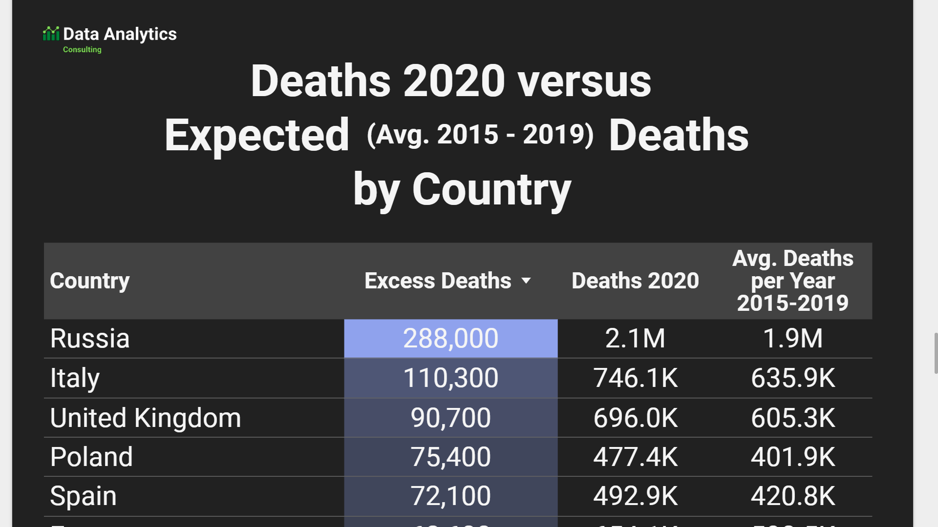
- Deaths in 2020
- Deaths per year 2015 to 2019
- Excess Deaths calculated by subtracting Deaths per year 2015 to 2019 with Deaths 2020.

